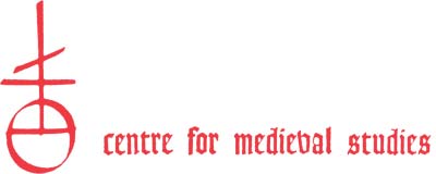
The Orb and Four was widely used as a device of early printers. The Orb is of southern origin and is also called mundus, pomum imperiale, ball, or globe; it stood for the world and was commonly part of the regalia of medieval kings. The Orb is a schematic mappa mundi with the bottom half representing Asia and the upper quadrants Africa and Europe. The Four was widely used as a trademark, especially on bales belonging to merchants of the staple, and also as a mark of craftsmen. It was of Northern origin and is thought to come from the D-rune, ᛞ. The number four had wide significance in the Middle Ages: the four elements, the four humours, the four cardinal virtues, the fourfold exegesis of the Bible, the quadrivium of the four sciences, geometry, astronomy, arithmetic, and music. The three rods form a double-barred cross and stand for the Trinity. The number three also had wide significance: the three theological virtues, the trivium of grammar, logic, and rhetoric. The trivium and quadrivium constitute the seven liberal arts of the medieval university. Seven, the sum of three and four, is the number of the planets in the Ptolemaic universe and of the deadly sins. Twelve, the multiple of three and four, is the number of months, of the signs of the zodiac, and of the Apostles, and is the Germanic base of counting, hence dozen and Charlemagne’s doze per. The full symbolism of the Four, lightly sketched here, extends to the whole world, graphically portrayed by the Orb on which it rests. Together, these two symbols form the device of the Centre for Medieval Studies.
The CMS logo and letterpress familiar to generations of faculty and students of CMS was designed by the Canadian graphic artist Allan R. Fleming (1929–78), best known for his 1959 logo for Canadian National Railways. He designed the CMS logo of a cross surmounting a globe with Gothic letterpress when he was head of graphic design at University of Toronto Press from 1968–76. Fleming’s design was as it appears above in lower-case Goudy Text, with a modified ‘v’. This was modified in the early 1990s by substituting capitals at the beginning of “Centre”, “Medieval”, and “Studies”. We have restored the original form in the signage that has been installed at the two main entrances to the third floor of the Lillian Massey Building as a tribute to one of Canada’s earliest professional graphic designers and as a gesture to CMS’s early history.


_5.jpg)